Taking a look back at well recognized brand identities and what they look like today is a great way to see design trends and how they are applied.
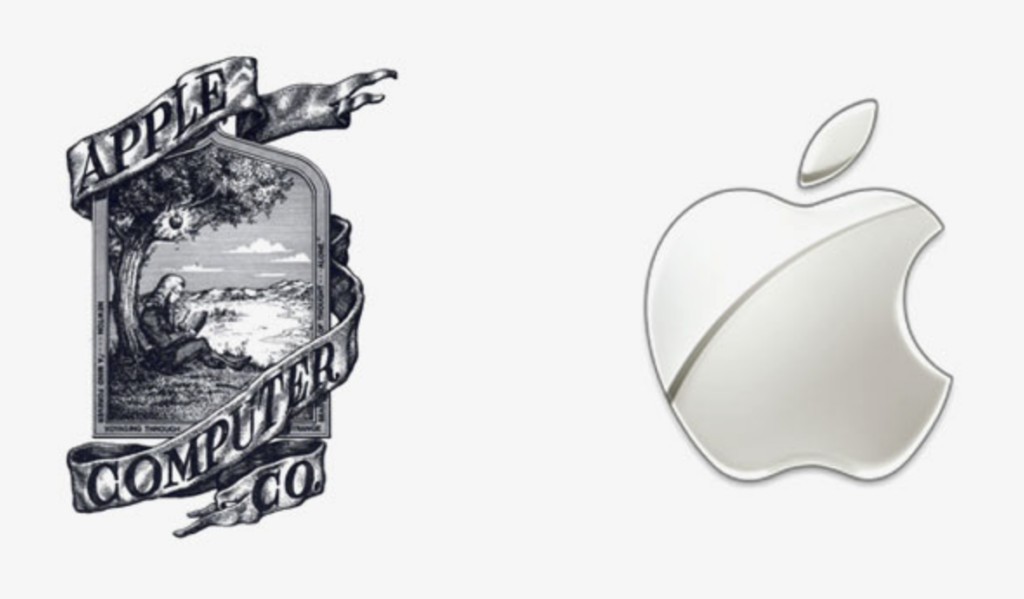
Many of today’s most recognized brand identities, from here after called logos, are almost unrecognizable from their origins. Apple Inc. is probably my most favorite example. There are many videos and even a movie that tells the story of the origination of the name, but I like to look at the graphics. A man sitting under an apple tree. A very litteral interpretation AND a very involved design. The logo contains a man seated beneath an apple tree with an apple IN the tree… with highlights no less. It is a full-on scene complete with hills, skyline and clouds in the background. A fancy ribbon affect with text wrapping the entire image. Wow. That is a lot in todays design standards, right?
It probably could not be any further from the evolution of the logo that we see today (2023). A flat apple shape with one leave above it and a half circle, representing a bit out of the apple, taken from one side. Notice how the bit is over simplified as well. No teeth marks. That would personalize an otherwise very simplified design.
I typically teach young designers to think it simplicity and to try and not have the tools used to be seen before the brand. An example of this is when the personal computer first met the Adobe company, a la Adobe Illustrator. Blends were all the rage in design. Prior to the computer program, Illustrator, blending colors in a design to be produced on a printing press was a bit involved. The graphic designer would have to either provide an image of the blend in paste-up (the act of assembling the camera-ready artwork for the printer), or provide the printer with instructions on how they would like the blend to appear and the printer’s camera department would create the blend. With the event of Adobe illustrator, designers would go crazy using blends on all their designs, because they could, I guess. The problem was that the technology had not quite caught up to the old school way of performing the task. The computer would create steps of shades rather than a smooth blend. You would look at a design with a blend and the first thing that would stand out were the stair steps within the blend. You could instantly know that it was created using Illustrator. Boo.
We have come a long way in computer aided design since then, but there are still examples of this today if you pay attention.
Don’t get me wrong, I’m not against a design allowing the tools that created it to shine through. Not at all. Rembrandt was famous for thick brush strokes and thick layers of paint. Something he was ridiculed for in his time. Designs that are computer aded can and do provide results not otherwise achievable by hand can be spectacular. My approach in commercial art is to not have the tool be the first observed aspect of a design. I like it to be more like an onion with layers. Take in the design as a whole, then the individual aspects (or layers).
In the examples below (kudos to bore panda.com for the examples) see how designs have progressed over time. Notice the simplification of the design and/or spot the progression of the designers thought process and tools.

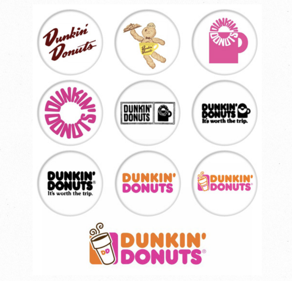
Note: A brand is not a logo or an identity. A brand is a much bigger concept. A brand is how your target market perceives you through their interaction with all of your brand aspects. A logo or brand identity is but one of those aspects. Where most see a logo and call it your brand… what they are actually seeing is your brand’s identity. Your brand identity is only one aspect of your brand marketing. It is your most visual aspect in most cases, but still just one part. Everything you or your company does from how you answer the phone or follow up a contact, or how you provide your product or service(s) is part of your brand. So when you see a logo, a mark, or identity… you are seeing a brand’s identity (or brand identity). Ultimately, that is why it is so important… because it represents ALL of the effort and dollars you or your company put behind influencing your brand image in the minds of your target market. This is also why keeping a brand identity fresh is so important! The example above of Dunkin’ Donuts is a good one. in 2022 they introduced DD into their marketing to attempt to bring in a younger audience. Abbreviation of a word is popular in this time. Buffalo Wild Wings using BWW (b-dub) is another example.